目次
Bootstrap5のモーダルのサンプル
ボタンをクリックするとモダールでダイアログが開きます。
モーダルはダイアログ外の箇所の操作が不可能になります。
以下は、Bootstrap5公式のmodalのリンクです。
https://getbootstrap.jp/docs/5.0/components/modal/
Bootstrap5のモーダルのコード
ダイアログのレイアウト(ヘッダーとボディとフッター)の図
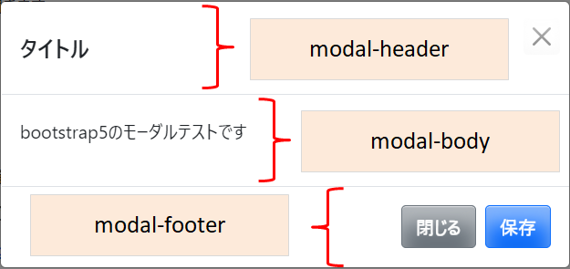
ヘッダーは、modal-headerに
内容は、modal-bodyに
フッターは、modal-footerに記述します。
<link href="https://cdn.jsdelivr.net/npm/bootstrap@5.0.0-beta1/dist/css/bootstrap.min.css" rel="stylesheet" integrity="sha384-giJF6kkoqNQ00vy+HMDP7azOuL0xtbfIcaT9wjKHr8RbDVddVHyTfAAsrekwKmP1" crossorigin="anonymous">

<body>
<button type="button" class="btn btn-primary" data-bs-toggle="modal" data-bs-target="#md1">
modal-test</button>
<div class="modal" id="md1" tabindex="-1">
  <div class="modal-dialog">
    <div class="modal-content">
      <div class="modal-header">
        <h5 class="modal-title">タイトル</h5>
        <button type="button" class="btn-close" data-bs-dismiss="modal" aria-label="Close"></button>
      </div>
      <div class="modal-body">
        <p>bootstrap5のモーダルテストです</p>
      </div>
      <div class="modal-footer">
        <button type="button" class="btn btn-secondary" data-bs-dismiss="modal">閉じる</button>
        <button type="button" class="btn btn-primary">保存</button>
      </div>
    </div>
  </div>
</div>
 <script src="https://cdn.jsdelivr.net/npm/bootstrap@5.0.0-beta1/dist/js/bootstrap.bundle.min.js" integrity="sha384-ygbV9kiqUc6oa4msXn9868pTtWMgiQaeYH7/t7LECLbyPA2x65Kgf80OJFdroafW" crossorigin="anonymous"></script>
</body>
</html>
1,23行目は、CDNのbootstrap5のURLを指定しています。
コード中にJavaScriptは不要です。
| data-bs-toggle="modal" |
4行目のdata-bs-toggle="modal"が6行目のclass="modal"とひも付きます。
| data-bs-target="#md1" |
4行目のdata-bs-target="#md1"は、6行目のid="md1"とひも付きます。
| data-bs-dismiss="modal" |
ボタンを閉じる場合は、data-bs-dismiss="modal"を指定します。
モーダルの大きさを指定
<div class="modal" id="md1" tabindex="-1">
  <div class="modal-dialog modal-xl">
    <div class="modal-content">
bootstrapにモーダルの大きさのクラスが用意されています。
2行目のmodal-xlは、max-widthが1140pxになります。
modal-smは300px、modal-lgは800px、指定しない場合は500pxです。
上記以外の大きさにする場合
<style>
  .modal-custom {
  max-width: none;
  width: 1200px;
}
</style>
max-widthをnoneで打ち消し独自にwidthを指定します。
モーダルの色/大きさを指定
モーダルはmodal-backdropクラスに値を指定します。
<style>
  .modal-backdrop {
  background: yellow;
  height: 300px;
}
</style>
モーダルの色を黄色で高さを300pxにしています。
関連の記事