| 説明 | border-radiusとは |
| サンプル | 1.四角の角を丸くする(半径10px) |
| 2.四角の角を丸くする(半径30px) | |
| 3.四角の角を丸くする(半径10%) | |
| 4.四角の角を丸くする(半径30%) | |
| 5.角を楕円形にする(横10px、縦30px) | |
| 6.角を楕円形にする(横30px、縦10px) | |
| 円を作成する | |
| 角を個別に指定する |
border-radiusとは
border-radiusは、四角の角を丸くします。
| border-radius : 値(4つの角) |
| border-radius : 値(左上と右下) 値(右上と左下) |
| border-radius : 値(左上) 値(右上と左下) 値(右下) |
| border-radius : 値(左上) 値(右上) 値(右下) 値(左下) ※時計回りです |
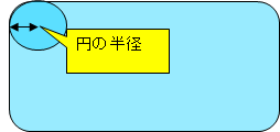
設定する値は丸くなる部分の円の半径の長さです。
値は以下を設定します。
| 数値 + 単位 | 指定した単位で設定します。初期値は0。 |
| 数値 + % | 水平方向はボーダーボックスの幅、垂直方向はボーダーボックスの高さを参照します。 |
角を楕円形にする場合
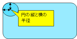
角を楕円形にする場合は、border-radius : 値1 / 値2のように2つの数値をスラッシュ区切りで指定します。
値1が円の横の半径で、値2が円の縦の半径です。
1.四角の角を丸くする(半径10px)
border-radius:10px
pxを指定しています。
<style>
  .test1 {
    border-radius: 10px;
    border: 1px solid #000;
    background-color: #e0ffff;
    width: 300px;
    height: 50px;
  }
</style>
<div class="test1">border-radius:10px</div>
2.四角の角を丸くする(半径30px)
border-radius:30px
pxを指定しています。
<style>
  .test2 {
    border-radius: 30px;
    border: 1px solid #000;
    background-color: #e0ffff;
    width: 300px;
    height: 50px;
  }
</style>
<div class="test2">border-radius:30px</div>
3.四角の角を丸くする(半径10%)
border-radius:10%
%を指定しています。
<style>
  .test3 {
    border-radius: 10%;
    border: 1px solid #000;
    background-color: #e0ffff;
    width: 300px;
    height: 50px;
  }
</style>
<div class="test3">border-radius:10%</div>
4.四角の角を丸くする(半径30%)
border-radius:30%
%を指定しています。
<style>
  .test4 {
    border-radius: 30%;
    border: 1px solid #000;
    background-color: #e0ffff;
    width: 300px;
    height: 50px;
  }
</style>
<div class="test4">border-radius:30%</div>
5.角を楕円形にする(横10px、縦30px)
border-radius:10px/30px
10px/30pxを指定しています。
<style>
  .test5 {
    border-radius: 10px/30px;
    border: 1px solid #000;
    background-color: #e0ffff;
    width: 300px;
    height: 50px;
  }
</style>
<div class="test5">border-radius:10px/30px</div>
6.角を楕円形にする(横30px、縦10px)
border-radius:30px/10px
30px/10pxを指定しています。
<style>
  .test6 {
    border-radius: 30px/10px;
    border: 1px solid #000;
    background-color: #e0ffff;
    width: 300px;
    height: 50px;
  }
</style>
<div class="test6">border-radius:30px/10px</div>
円を作成する
<style>
  .test7 {
    border-radius: 50%;
    background-color: #1e90ff;
    width: 30px;
    height: 30px;
  }
</style>
<div class="test7"></div>
widthとheightの値を同じにして、border-radiusを50%にすると丸が作成できます。
角を個別に指定する
角を個別に指定することもできます。
| 指定方法 | 意味 |
|---|---|
| border-top-left-radius 例:border-top-left-radius:10px; |
左上を指定 |
| border-top-right-radius 例:border-top-right-radius:10px; |
右上を指定 |
| border-bottom-right-radius 例:border-bottom-right-radius:10px; |
右下を指定 |
| border-bottom-left-radius 例:border-bottom-left-radius:10px; |
左下を指定 |
関連の記事